I love many things about Google’s Universal Analytics, but one thing I don’t love is how difficult it is to understand implementations at scale.
If you’ve ever configured multiple properties with the same/similar custom dimensions, you know that there is no way to compare definitions at-a-glance across properties. This is something that GA’s UI simply doesn’t have. The only semi-decent option is to review the definitions for each property individually, copy and paste them into a spreadsheet, and then reformat to see values side-by-side. If you find issues and make updates, you must redo that entire (manual) process.
Maybe that’s reasonable for 2 or 3 properties, but what if there are 50 or 100 properties, each using all 200 custom dimensions? It’s an ugly prospect. My own experience is that this friction here means that the audit/comparison is simply not done, leaving your organization constantly at risk of losing data or collecting it incorrectly/inconsistently.
If you’re working on a migration (perhaps to GA4…), you also need to see this view, to understand the current configuration and know what your new implementation needs to support.
Enter Intarsia’s Custom Dimension Definition Comparison tool. Select accounts and properties, click Build, and Intarsia pulls all of their definitions together into one table.

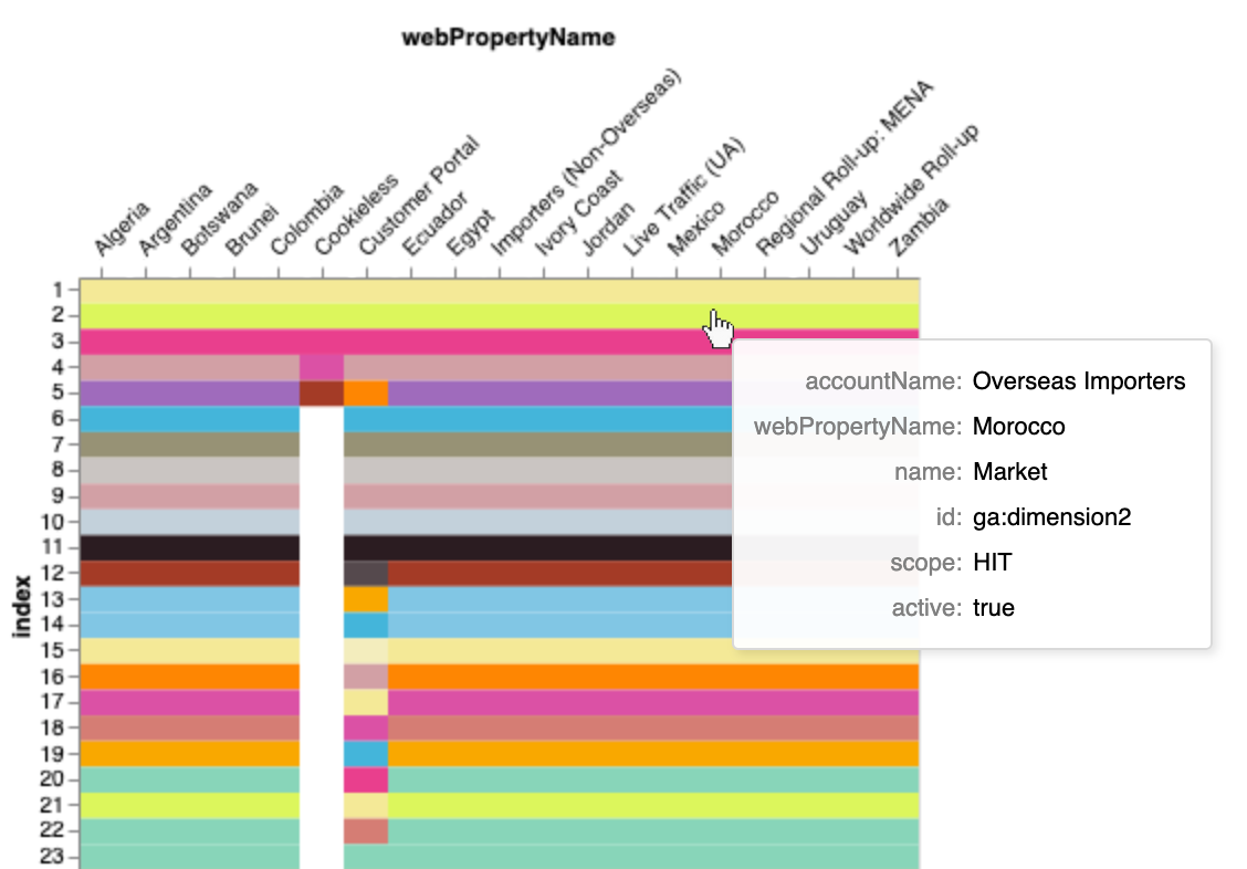
More exciting though - you can view the definitions in a heatmap (based on name, scope, or activity), to quickly spot differences - and interact with the heatmap by hovering to show details:

If you’re thinking, why don’t you have one of these for GA4? Well - stay tuned!


